In Palladio, scholars can organize their tabular data into digital visualizations with maps and graphs. Using the same data from the WPA Slave Interviews that I used to make Kepler.gl maps and to create text visualization in Voyant Tools, I examine what Palladio can tell us about the same interviews. Its graphs and maps highlight networks (which may include connections at specific geographic points) rather than mapping points or events.
By selecting different metrics in Palladio in accordance with data tables, one can see patterns and identify outliers.
One can create a similar graphic to Kepler.gl. The two samples below show the location of the interviews and the location where people were enslaved in Kepler.gl and Palladio.


In addition, Palladio lets the user select different relationships, such as:
The person conducting the interviews and the particular kind of ex-slaves (house or field) who were interviewed.
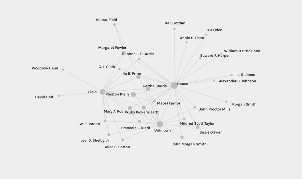
And what topic different interviewers discussed.

One useful feature is that the scholar can manipulate the graphs by dragging and dropping nodes to create a different shape. Here I pulled topics to the outside to show how topics occur across interviews.
The graph shows similar data to what one can gather from Voyant Tools. One can see the topics that emerge in the interviews as one can see in Voyant Tools (see below) with the added feature of identifying the interviewers who discussed these themes.

Although some of the graphics look like tangles knots where the researcher may get more from looking at a data table, other graph metrics help us see outliers and patterns. For example, if I pick source: type of slave and target: topics, then I see that most topics were covered by both house and field slaves, but certain topics (Mammy) were only discussed by house slaves and certain topics (travel) only by field hands.

Changing metrics (source: interviewer; target: topics [ see above]) shows that the interviews that discussed travel likely are outliers since only one interviewer is associated with interviews discussing travel Thus, Palladio can help the researcher identify differences.
Palladio has a very useful “how-to” guide at https://hdlab.stanford.edu/palladio/help/ that explains what kind of data tables can be uploaded and how the different features can manipulate the data.
Palladio features are good at highlighting networks, and its interface is relatively easy to learn.